Tuesday, August 14, 2012

3rd Quarter Midterms

Midterms are over for my third quarter and boy did I have to amp up the quantity of the work. With the exception of two of these projects all of them took place within a weeks time as midterm projects.  We will start with all there Character and Object Design course work first.

Character and Object Design Midterms

These first two were the only two that were done the week before midterms. Still working on generic character and monster designs but mainly focusing on learning how to digitally draw and paint then really coming up with a good design. 

This guy is a nomadic warrior. I didn't really have any back story or thought put into him, again it's just for practice painting.
 This next one however we started to think a little bit more into creating something conceptually rather then just painting. We had a choice to design an Alien (intelligent) or Creature (instinctual). I choose a creature and from there had to break it down even further having it be from the wild, a pet, tamed as a mount or a beast of burden.  I narrowed it down to a beast of mount of sorts, who ferries a race of people who live in underwater domes. Using its 10  legs it bounces and skims along the bottom of the ocean carrying its passengers in a bubble tank strapped to its back. The head has a proboscis like mouth for scavenging for food between small rocks and eyes on the top of its head to watch for predators.
Now we get into the Midterm work. For our midterm in Character and Object Design we had to design a traveling musician from the future, who was part of an underground movement to overthrow the dysatopian like government. The musician also had to be able to use his instrument as a weapon. This project came from a weekly character design contest held on conceptart.org

These first few sketches were quick and I tried to get as many ideas out as I could. One method I used was silhouetting where I just focus on the characters silhouette. 

I picked a face and then played around with feature spacing and shape symbolism.

 Trying different weight and height sized bodies.
 Costume conceptualization.
 Body turn around for 3D modeling sheets and drawing guide.
 Facial expressions with the chosen face.
 Hand and feet studies with the costume.
 Dynamic pose turn around.
 Concept painting using one of the dynamic poses. In hindsight I would have liked to add a little more futuristic "tech" to him to reinforce the futuristic feel.

 Principles of 3D

This chair scene I did was to practice with 3ds Max's 'Mass FX' feature that simulates physics. In class we learned how to use this to scatter rubble in a dynamic way. I used stock chairs.
 This was the final object for homework we had to make, which used the majority of the modeling tools we have learned so far. Now we are moving into texturing, lighting and a little animation.
 This assignment was given to us for homework, however to link the bullets together we only needed to put a block between each one. Because of my military experience I knew how 50 cal bullets are linked so I went ahead and accurately modeled the linkage.
 For our final project in this class we are building a tank. It doesn't have to be able to go into a game engine (that's next class). We will also be texturing, lighting it and putting it into a small scene so the instructor has given us all quarter to work on it as we learn the 3ds Max. This is my progress so far.


 Visual Language and Communication

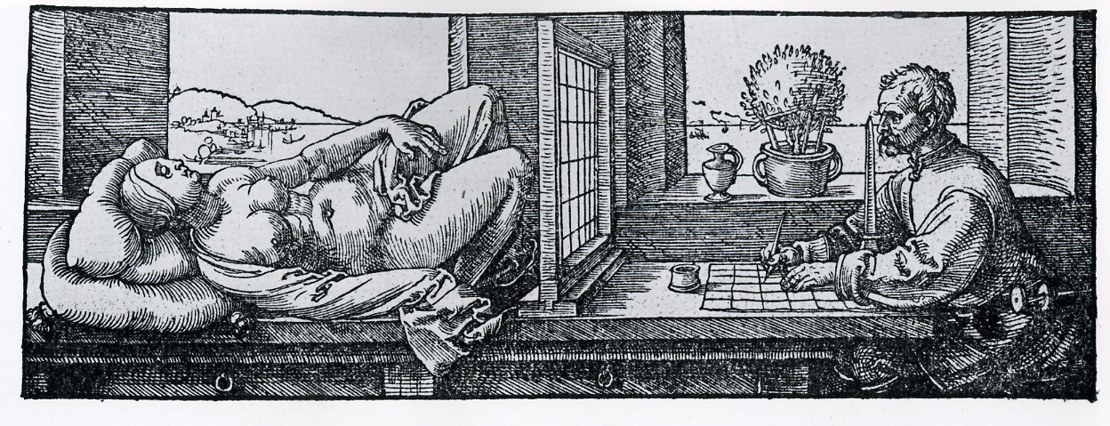
This is a funny one. In my Visual Language class our midterm was to pick a peice of art from a list that was given to us, and recreate it in our own way. We were allowed to make changes in our version to modernize it or make it funny. Then we had to write a paper on the use of perspective in the piece. I choose Draftsman Drawing a Nude. This is the original.

This is my version done in Photoshop.

Principles of 2D Animation

The assignment assigned us an Olympic sport by drawing out of a hat. We then had to have a short animation of a cartoon flower sack attempting the sport. This was done with 120 hand drawn pictures, photographed one by one. 

Saturday, July 21, 2012

Into the 3rd

Third quarter just started for me last week and I have a couple new things to post up. These are all some of my first digital drawings for my Character and Object Design class. All the work in the class will be done digitally in Photoshop. Here our assignment was to just practice painting on the computer and come up with a good character and evil character design.  

This guy was just for practicing painting with a tablet.


 For the next two drawings, we had to paint abstract shapes with a random brush. Once we thought we saw a character in the shapes we pulled them by adding details and refining their outline. I found this bear/bat creature.
Once we got through the concept stage we had to take our concept and plan out the character. We were allowed to change the character up slightly. I elongated the head and flattened the sides of the head to make him look a little more like a bat.. 

Sunday, May 13, 2012

School is going well. We are half way through the quarter and I have already signed up for the next quarter's classes. Some of the classes I will be taking next quarter are "Character and Object Design", "2-D Animation Principles", and "Principles of 3D Modeling". 

Here are a couple things I have worked on in the last couple weeks.

This first one is a sketch for Drawing and Anatomy, "mannequinizing" the human figure from a photograph of a model. We were only given a picture of her pose from one angle and we had to draw the same pose from many different angles.


This one is also from Drawing and Anatomy. We were told to draw the mannequin form in action poses and bring it to class. There he critiqued our drawings and he drew his interpretation of the pose (the figure between the center and furthest right pose is his interpretation of mine). His biggest suggestion for me here is to keep the figures loose and more organic.


This is a quick practice drawing from Perspective class. What I am practicing here is the idea of drawing the overall shape of an object as a box and then "cutting out" sections of it to take on the intended shape but still remain in perfect perspective.


These next two are for my Image Manipulation class. This was our midterm project. The project was to make a book cover, related to our major, as if we wrote the book. The back cover was just extra credit. We were told to use images from the web, so I don't take credit for any of the images. 


Again I don't take credit for the werewolf or the background picture. We were handed pictures of a comic style black and white drawing that our instructor got from the internet and we had to scan that picture in and colorize (texture) him and give him a background. The background had to be a real photo that we made look like a comic book to match the subject.


Friday, April 20, 2012

Back in Action

So It's been a few weeks. Break is over and I am in week 3 of my second quarter. The second quarter isn't exactly like the first where every week I had a lot of new projects to work on and I had a lot to show. This quarter, for the most part, is sketchbook work, repetition and just learning software. But I do have a couple things I can post up. I don't have a scanner so the hand rendered pencil sketch and drawing were photographed and spruced up in Photoshop. They didn't come out as well as I hoped, but I plan to replace these pictures with scanned versions in the future.

1st week in Perspective Drawing class, we reviewed the basics of perspective we had learned last quarter. The homework was to work on a drawing showing what we already knew with perspective using basic shapes. For now we are just using pencil.


In week 2 of Image Manipulation our assignment was to take this picture of a man (left), and make him look 10 years younger (right). This was a homework assignment to see how much we had learned so far.


Week 3 of Drawing and Anatomy, we had to draw some mannequin poses from pictures of human models. No tracing was allowed and we had to draw our first one with correct proportions before extending guidelines to do the other poses. Again sorry for the pore quality picture.


Thursday, March 22, 2012

My Top 5 Projects of Quarter 1

Normally I update on Saturday's and Thursdays, but last Saturday something came up that I needed to spend some time with and then ultimately got me feeling sick by being out in the down poring rain for a day. So now It's Thursday and the 1st quarter is wrapping up. In celebrating one quarter down and making up for a lack of a post on Saturday, I decided I would upload my top 5 projects of the quarter that haven't been posted yet.


This is a Japanese horror movie poster that I made as a final project for color theory. We had to research a foreign countries layout out and color usage for either horror movies or sci-fi movies and create a movie poster of our own portraying what we learned. The poster also had to have a concept for the movie behind it. I chose Japanese horror movies. 

All the Japanese Kanji is done in an online translator. The content of the text isn't as important as the placement of it, the color of it and of course it being in a foreign language. The concept of the movie I came up with is a spirit that posses people forcing them to consciously murder their friends and family. If the person possessed is killed by another person the spirit secretly transfers to the killer and the cycle continues. The picture in the poster represents this by the spirit reaching out of the eye. This was all photo manipulation in Photoshop.


This next project is also a color theory project. This was my Psychedelic Portrait for week 6. We were allowed to go all out with colors and just have fun. There are a lot of things in the picture so to fully enjoy it I recommend clicking on it and viewing it in a larger format. Of course because this is a portrait; I'm the one coming out of the liquid and the eyes in the sky are mine as well. This was all done in Photoshop.


Another project for Color Theory makes it to my top 5. This one is again in Photoshop, but this is digitally painted rather then dabbling in photo manipulation. The project was to design a Tattoo with symbolism and colorize it different ways following color schemes we had previously learned. It was more of a review assignment but offered a great opportunity for me to practice digital painting. I am prior military and the symbolism represents how I felt the Navy was holding me back, more of a past feeling because now I can afford to go to school because of the Navy. 


Here is a painting I did for Fundamentals of Design class. This project was for week 6 as well. I'm demonstrating my understanding of visual rhythm. The best way, I thought, to demonstrate rhythm, more specifically progressive rhythm, was to slowly morph an object into another object. I was trying to think of opposite's that I could apply this to. Even though a pencil and an eraser are common around each other, what better opposites then a tool for creation and a tool for destruction. The vertical line of the pencil also enhances the rhythmic feel as apposed to an already curved shape. This was done in acrylic paints.


Finally this is a 1 point perspective drawing for my Observational Drawing class week 8. We were instructed to walk around the school and find an internal location to draw in perspective. The lines on the wall are the shadows cast by the light fixtures. This is all done in pencil.


Thursday, March 15, 2012

2 More Previous Work

I finalized my personal logo and it has been applied it to the left sidebar of the blog. I also thought I would upload a couple more projects from the past. I hope to have all my work from quarter 1 posted before the start of quarter 2 coming up in a few weeks.

Here is a pencil drawing exploring reflection and transparent surfaces for my Observational Drawing class. This was a good opportunity to practice ovals with cups and glasses. If I were to redraw or improve this drawing, I would make sure the glass didn't lean to the right, as well as make the top flat part of the upside down reflective bowl a smaller oval.


This Color Theory project we had to pick a logo and using color re-design it to appeal to some other audiences. I chose the colors for the adult's logo to feel more professional or classy. The Teenage boy's logo color choice was an attempt to portray excitement and action. The teenage female logo was designed to be eye catching.


Keep in mind you can click on these pictures to view them in a larger size if you wish.

Saturday, March 10, 2012

More Old Projects

This time I had to skip a week ahead in showing my Fundamentals of Design work because week 3's assignment apparently still needs to be scanned.

Here is my first Typography assignment I am showing. We spent 3 weeks developing our own typeface. I named it my new type face "Claw". This is hand rendered with pencil and then filled in with a thick marker.


This project was for week 4 in my Fundamentals of Design class. I will have to show my 3rd week assignment in another post. Here I was supposed to show my understanding of scale. We were to build a chair of some sort out of any materials, and it had to be at least a foot tall. I decided to make a throne out of plastic Jewels because my last name is Jewell. The piece is held together with E-6000 glue, it's supported with a sliced Styrofoam cone and sitting on painted cardboard. The back board is wire wrapped in the shape of a jewel with a necklace piece as the center point. Stick-on plastic gems were added to the backboard and base. Because it was so reflective it was difficult to get a good picture of the throne.


My final project to show you is my color theory project. We were demonstrating our ability to blend colors. We had to take an image or famous painting and reproduce it showing 4 different color gradients. One section had to be monotone, another section had to be shades of what ever color we wanted, another section had to be tints of the color we chose and a final section had to be tints and shades of complimentary colors. The painting I chose to reproduce was the "Virgin Annunciate" by Antonello da Messina in 1476.


Thursday, March 8, 2012

My Second Week

These were also completed and turned in a few weeks ago. They are some of the projects I worked on for week 2 of my first quarter in school.

This poster was a project for my Fundamentals of Design class. It's purpose was to show our understanding of unity within a design. The specifications stated the design must have a number spelled out, contain 4 squares and 5 circles and finally we could have one shape of our own choosing. I choose to layer the shapes over each other to outline the number one's shape in front of a red rectangle (the red rectangle being my custom shape) and spelling out "ONE" with positive and negative shapes.


Color Schemes were a little difficult for me. Not only was I learning what the color schemes were but I was also trying to learn how to mix paint to achieve the results I wanted. My color schemes project for my  Color Theory class didn't exactly come out the way I wanted. I traced a coloring book image of Spiderman and painted in new colors following color schemes. What's uploaded here is the actual paintings I did but I took it in to Photoshop and put in a black background then labeled the color schemes. It wasn't the most clean and well done work I've done but it was a good learning experience.    


This next project was an ink still life done in my Observational Drawing class. The goal was to demonstrate hatching and cross hatching techniques with pen. We were not allowed to do an under drawing in pencil, we had to start with pen on a blank sheet of paper. For this drawing all I used was a regular ball point pen.

Saturday, March 3, 2012

My First Week

I've uploaded some of my work from the first week of school. These were done and turned in many weeks ago but I'll upload projects here in week groupings to catch up to current work.

These two are scans of my Fundamental of Design projects for week 1. They are Japanese Notan designs made from cut out paper to show our understanding of negative and positive space.


This was our first assignment in color theory where we had to mix colors and paint our own color wheel with acrylic paint. I had no previous experience painting traditionally before this.


For Observational Drawing our first assignment was to draw a still life that was set up in class. This is the first drawing class I have ever taken.

Thursday, March 1, 2012

Introduction

Hello and welcome to my Blog. Here I will be posting many different things to record my progress towards becoming a Game Artist, which will include projects for school and personal work as well. Currently I am attending the Art Institute of San Diego for Game Art and Design and I am just over half way finished with my first quarter. I am looking forward to sharing my work and receiving feedback from you. Thank you.


-Ryan